Shepard designs Rolling Stones 50th Anniversary logo
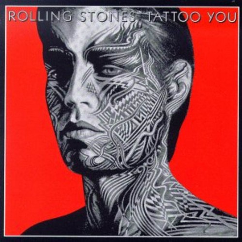
I’ve been a big fan of the Rolling Stones since my dad introduced me to “Satisfaction.” “Tattoo You” is one of the earliest albums I bought with my own money and I studied the album package obsessively… you may notice how its color scheme and iconic art could have inspired me? The Rolling Stones have had a lot of great art over the decades, but nothing can top their tongue logo, originally created by John Pashe in 1971. In my opinion, the Stones’ tongue logo is the most iconic, potent, and enduring logo in rock ‘n’ roll history. I think the logo not only captures Mick Jagger’s signature lips and tongue, but also the essence of rebellion and sexuality that is the allure of all rock ‘n’ roll at its finest.
I first worked with Mick Jagger and Dave Stewart on their project Superheavy. Mick and Dave were great to work with and I became at ease with our creative rapport despite their stature as musicians. However, when Mick Jagger reached out to me about designing a logo to mark the Rolling Stones’ 50th anniversary I was quite overwhelmed. Mick said he was open to any of my ideas . One of the first things I asked Mick was “don’t you think the tongue HAS to be included?”. He responded “yeah I guess it ought to be”. Case closed. I was very humbled and honored to be asked to work on the 50th logo so my objective was to service and showcase the Stones’ legacy rather than try to make my contribution dominant.
I worked on this project as a fan knowing that the Stones’ tongue was the focus and the starting point. With that in mind I set out to integrate the 50 in a creative and memorable way. I think the solution speaks for itself in celebrating the Stones’ trademark icon and historical anniversary. I’d like to thank the Rolling Stones for all their great music that has impacted my life and for allowing me to make a small contribution to their 50th anniversary. Cheers!
-Shepard Fairey


