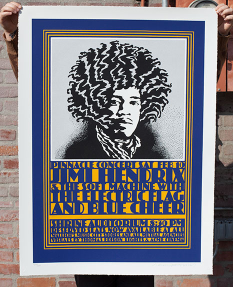
John Van Hamersveld, Pinnacle Hendrix Commemorative Edition
John Van Hamersveld’s Hendrix is my favorite poster of all time. I published a beautiful large format, fine art screen print edition of the image. Read more after the jump about the poster edition and history of the image.
-Shepard
Serigraph on Coventry Rag Smooth 335g/sm with Deckled edges. 32 1/4 x 44 1/4 inches. 5 Colors (4 Metallic). Edition of 180. Only a limited number will be available on this site. $600.00. Comes with Certificate of Authenticity.
Sale Date: 10/24/2013 at 10am in LARGE FORMAT PRINTS
SOLD OUT
Serigraph on Coventry Rag Smooth 335g/sm with Deckled edges. 32 1/4 x 44 1/4 inches. 5 Colors (4 Metallic). Edition of 180. Only a limited number will be available on this site. $600.00. Comes with Certificate of Authenticity.
Release Date: 10/24/2013 at 10am in LARGE FORMAT PRINTS
Best known for his legendary poster for the 1964 blockbuster surf film The Endless Summer and his album covers for the Beatles (Magical Mystery Tour), The Rolling Stones (Exile on Main Street), Jefferson Airplane (Crown of Creation), the Grateful Dead (Skeletons in the Closet), Kiss (Hotter Than Hell) and Blondie (Eat to the Beat), among others, as well as the mind-bending concert posters he created while operating the Pinnacle concert production company, John Van Hamersveld has built up a wide-ranging body of work over a career verging on its sixth decade. He has been at various times artist, illustrator and designer. Among his other creations: an official poster and 360-foot-long mural for the 1984 Los Angeles Olympic Games; illustrations for Esquire, Rolling Stone, Billboard; and branding and logos for Fatburger, Contempo Casuals and Broadway Deli. The iconography of his work runs deep, from Day-Glo tones to trippy swirls to the grinning “Johnny face,” an icon in itself.
Van Hamersveld’s “Pinnacle Hendrix” poster is one of the most recognizable and graphically powerful designs of the 1960s, and a quintessential expression of the psychedelic confluence of art, music and culture. The poster was originally created to promote Jimi Hendrix’s February 1968 concert at Los Angeles’ Shrine Auditorium, part of the Pinnacle concert series organized by Van Hamersveld and the Single Wing Turquoise Bird lightshow group. Though the Pinnacle concerts spanned less than a year, from November ‘67 to September ’68, they included such illustrious acts as the Grateful Dead, Jefferson Airplane, Big Brother and the Holding Company, Cream, Traffic, the Velvet Underground, The Who, Pink Floyd and of course Hendrix, with Van Hamersveld designing posters for every event. The original “Pinnacle Hendrix” poster was printed in a run of 2000 and distributed to head shops and bookstores around Los Angeles and the nearby beach communities.
The following is an essay by Shepard about the “Pinnacle Hendrix” poster for an upcoming book by design critic Steven Heller:
What makes a “perfect” image, one that couldn’t be improved by rendering it differently, that needs nothing added or subtracted?
Not only is a perfect image difficult to imagine any other way than it is, it’s impossible to forget. The term “instant classic” is used far too loosely, but it does truly apply to a perfect image. Many people recognize a perfect image when they see one, at least subconsciously if not deliberately. A perfect image has the power to seep into people’s minds and become the exemplar for the thing it depicts. When I think “banana,” I picture Warhol’s banana cover for The Velvet Underground and Nico; when I think of Jimi Hendrix, it’s John Van Hamersveld’s Pinnacle Hendrix poster that comes to mind.
Before discovering the Pinnacle Hendrix poster I had never thought consciously about what constituted, or how to make, a perfect image. John’s iconic image gave me an epiphany that sharpened my focus as an artist. The Hendrix poster fit all of the aforementioned criteria. It’s an illustration with the perfect balance of designed restraint and idiosyncratic, organic style. The image also, though highly stylized, conveys the essence of Jimi Hendrix.
However, it goes beyond style. Through abstraction, the black-and-white image achieves something similar to a Rorschach inkblot test: it takes on the different interpretations projected by each viewer. I immediately saw a connection to Beethoven in John’s rendering of Hendrix. I made the analogy of Hendrix’s Afro to Beethoven’s wig, and Hendrix’s ascot to Beethoven’s frilly frock. I’ve since seen this interpretation from other sources, and my assumption was that Hendrix was being put on a pedestal as a musician and cultural icon on the scale of Beethoven. When I spoke to John about the Pinnacle Hendrix image years later, he explained that the ascot was not inspired by Beethoven but by Eric Clapton and Cream, who Hendrix admired for their music and fashion. However, the Beethoven comparison had inspired John to illustrate a fantastic series of classical composers.
Great images have the power to inspire consciously and subconsciously, creating a dialog and cycle of inspiration between artist and viewer. When I decided in the early ‘90s to make mash-ups of my Andre the Giant image with famous images from pop culture, I didn’t think twice about where to start. He was no Jimi, but I must say Andre took to that psychedelic Afro like a natural.
– Shepard Fairey


